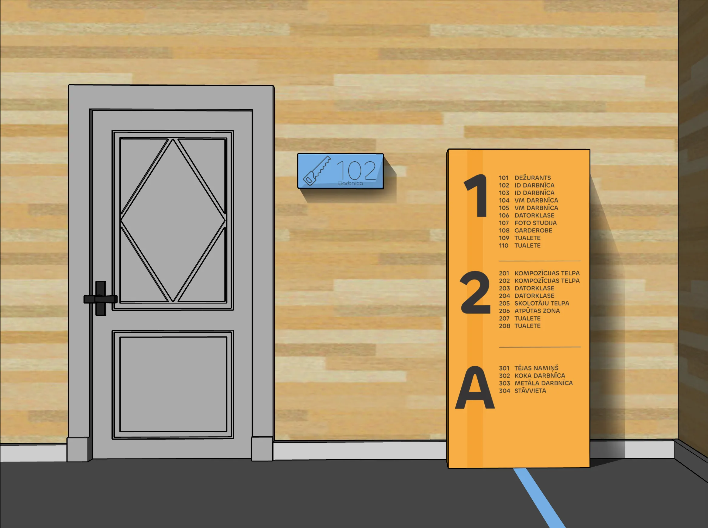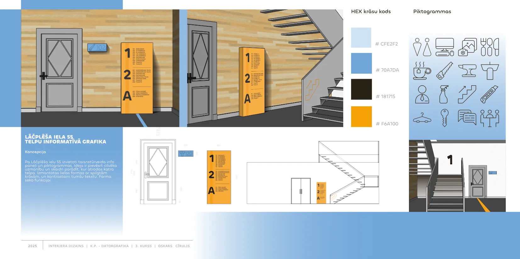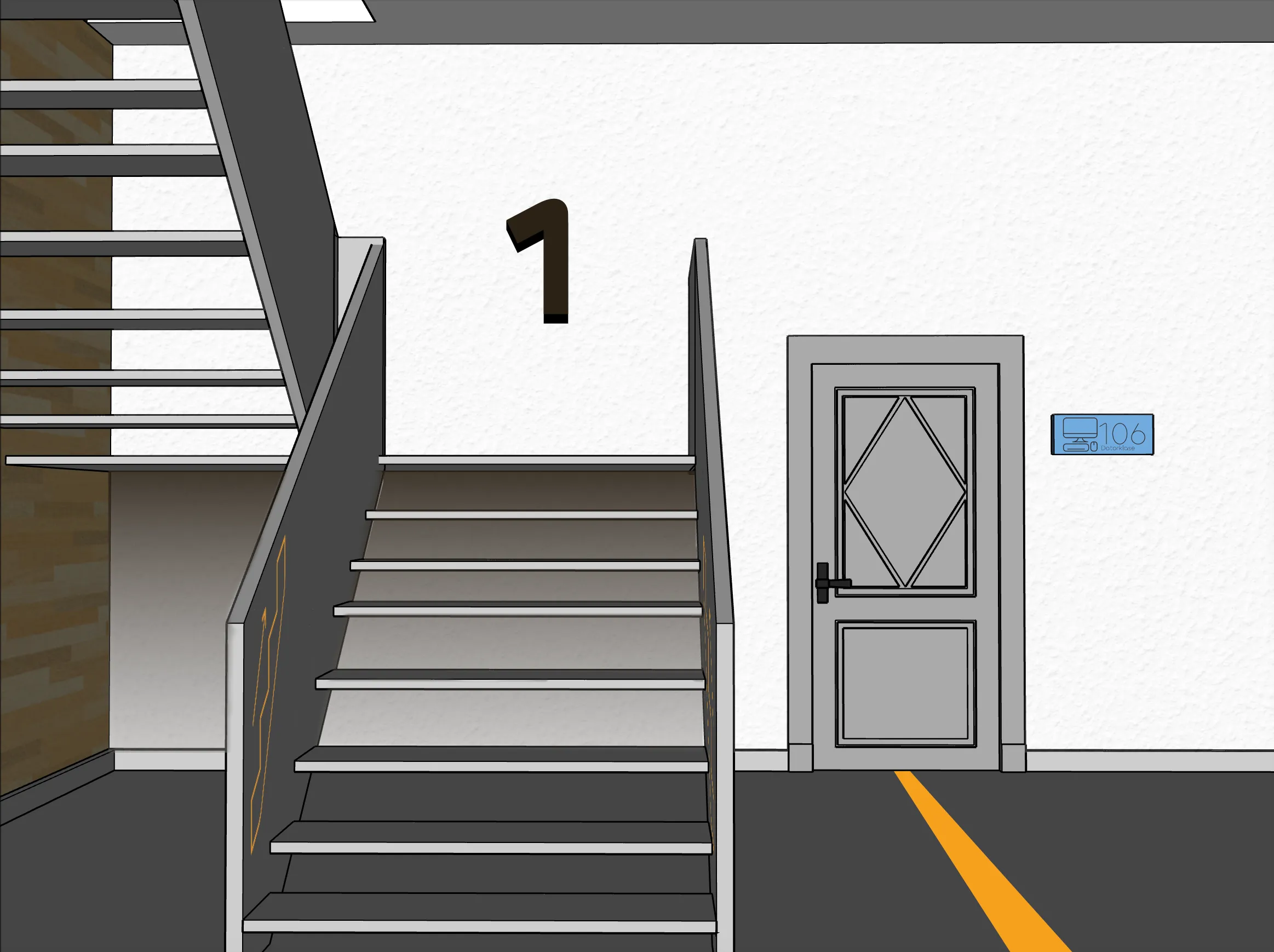
In this project I had to remake my schools navigation system. This was challenging, since it is a public school and needs a great system of navigation.
For the materials I wanted to use cork and dense plastic. Cork is easy to get, cheap and comes in many colours. It is very sustainable. As for the plastic. It counts as a surface finish to the cork shapes, to minimize the material usage.
The colour palette should be bold and attention grabbing with large and bold letters for everyone to see them.
As for the font and navigation pictograms I used minimal shapes and medium bold lines to make them pop out and feel conected
In this project I had to remake my schools navigation system. This was challenging, since it is a public school and needs a great system of navigation.
For the materials I wanted to use cork and dense plastic. Cork is easy to get, cheap and comes in many colours. It is very sustainable. As for the plastic. It counts as a surface finish to the cork shapes, to minimize the material usage.
The colour palette should be bold and attention grabbing with large and bold letters for everyone to see them.
As for the font and navigation pictograms I used minimal shapes and medium bold lines to make them pop out and feel conected
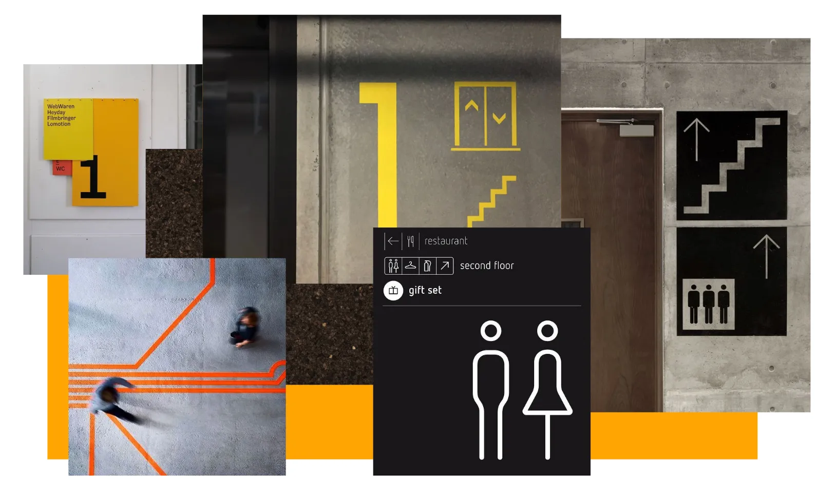
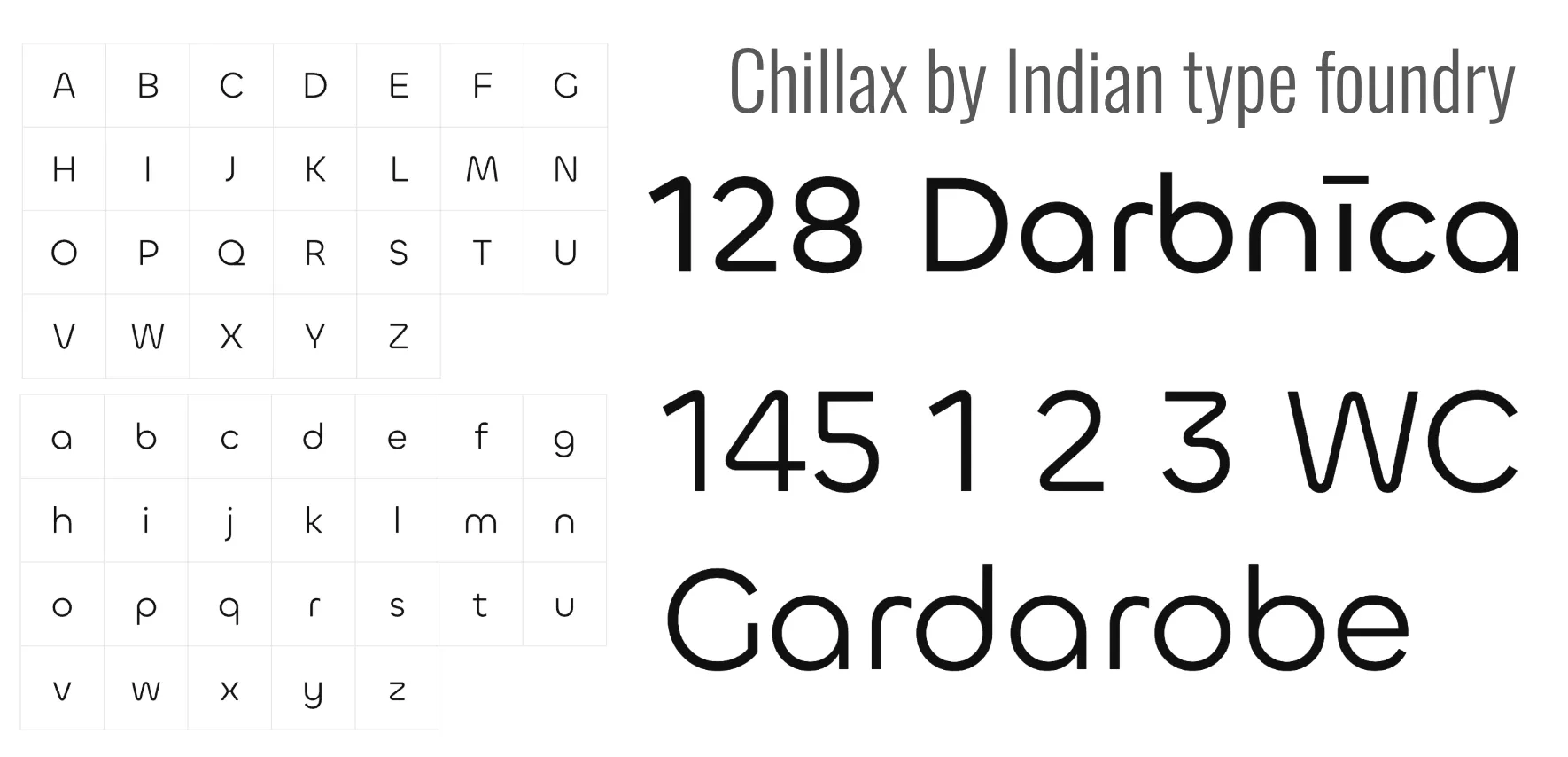


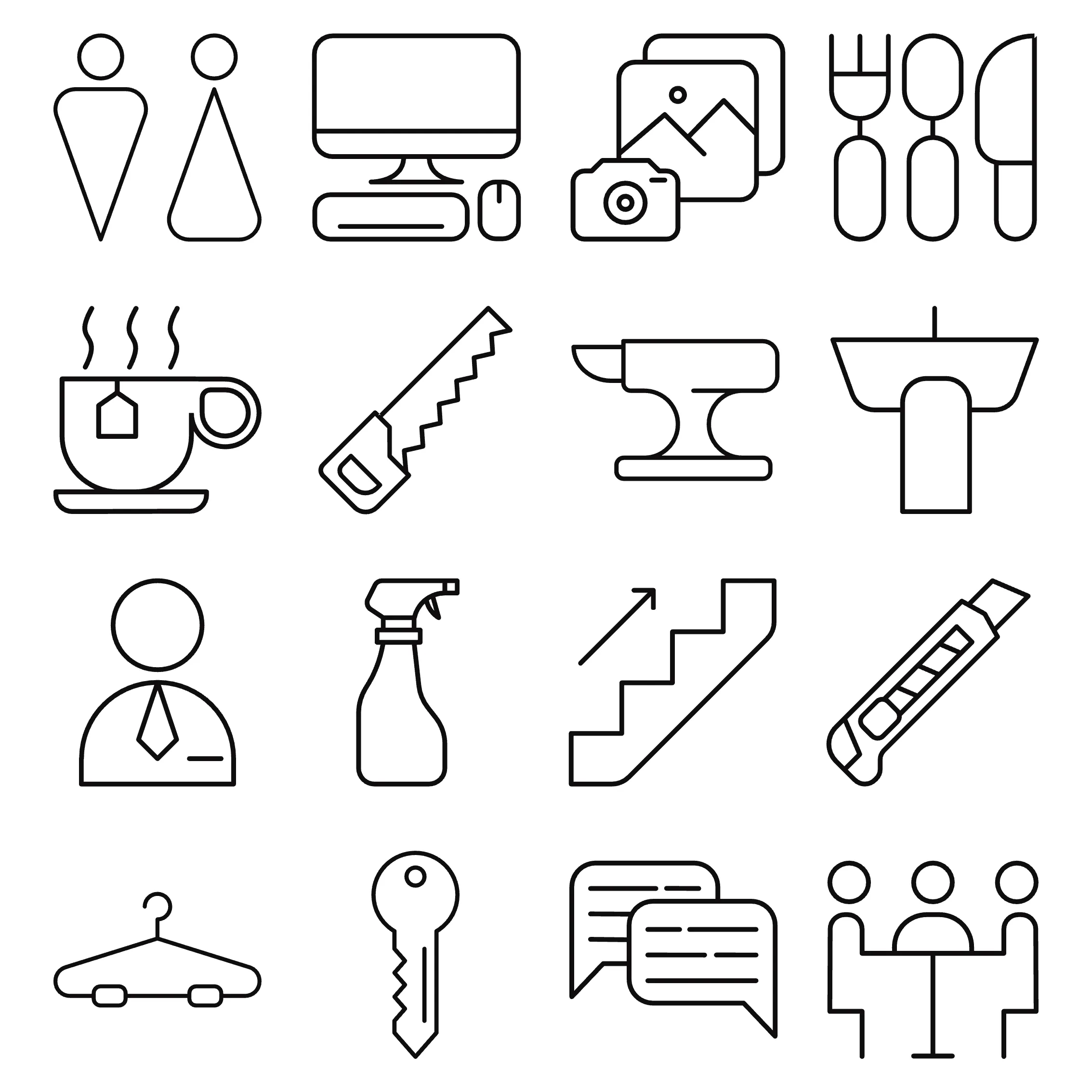
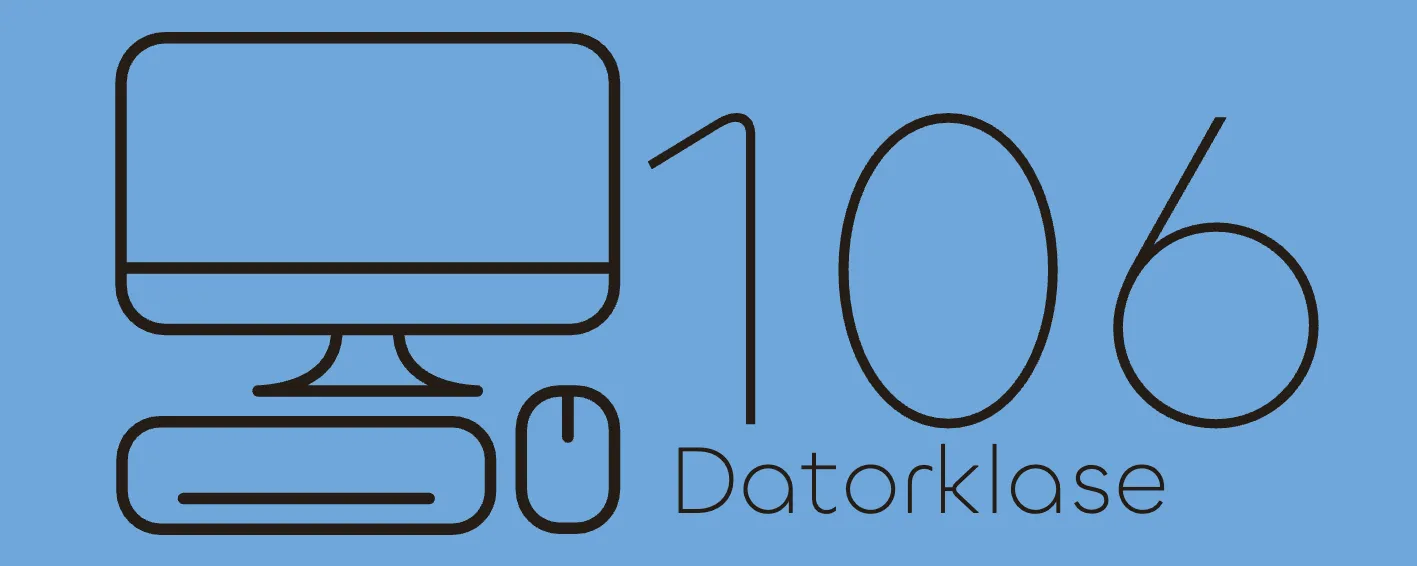
The pictograms are unique in their semi bold lines. In this case, with rounded edges and small details, they fi perfectly with the font I chose, Chillax by Indian type foundry.
The designs are not as unique but they are easy to read for the students and teachers.
The pictograms are unique in their semi bold lines. In this case, with rounded edges and small details, they fi perfectly with the font I chose, Chillax by Indian type foundry.
The designs are not as unique but they are easy to read for the students and teachers.
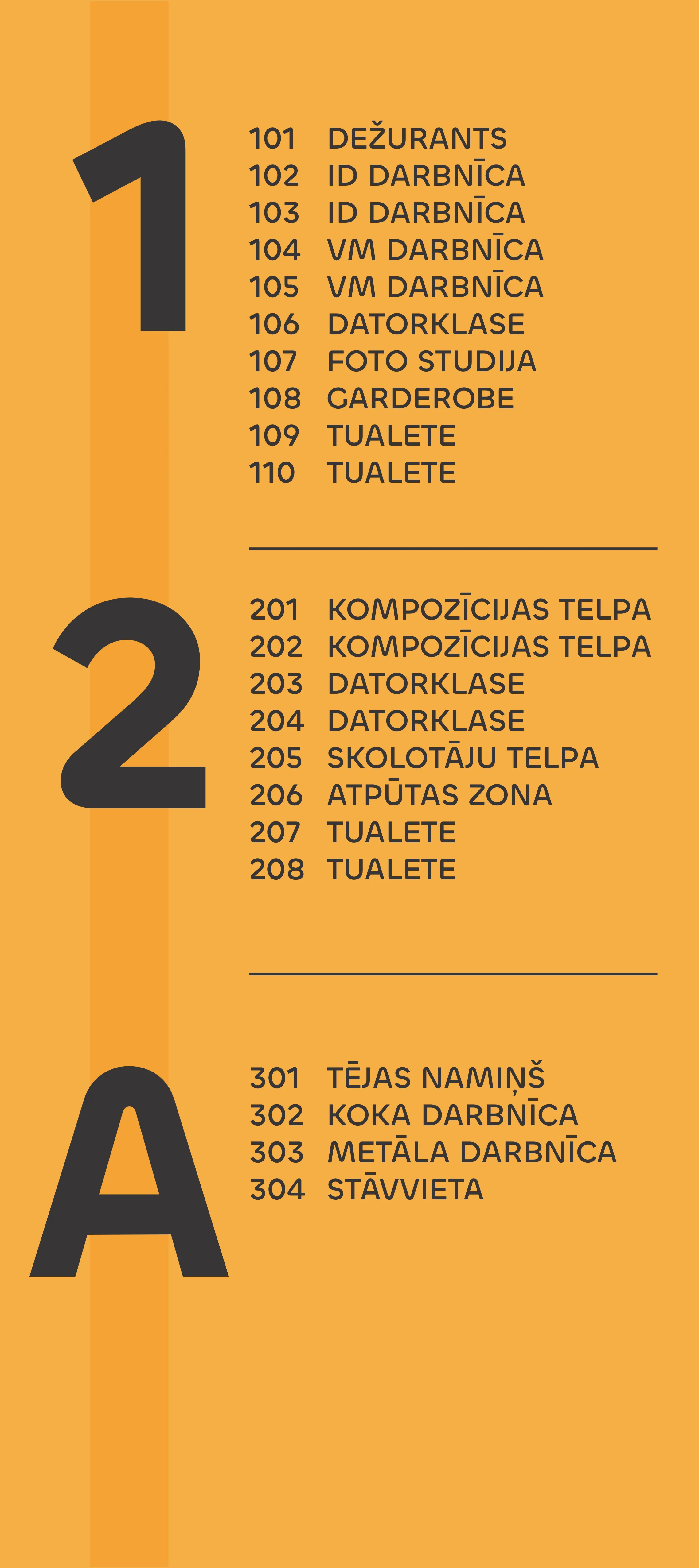


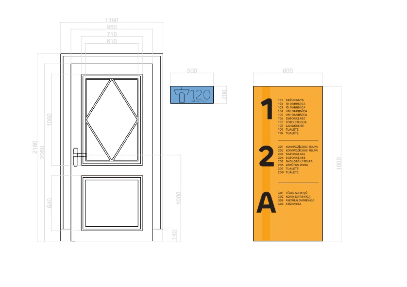
In these small visualisations, I showed the colours, text and pictograms in use. the yellow with the dark brown work very well and they bring attention. the room numbers are less visible, however they can be read easily.
The pictograms are quite big and through size and colour.
In these small visualisations, I showed the colours, text and pictograms in use. the yellow with the dark brown work very well and they bring attention. the room numbers are less visible, however they can be read easily.
The pictograms are quite big and through size and colour.